


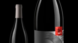
MARKETING PRIZE - expovinArt
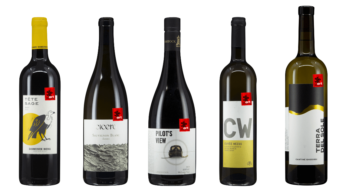
ExpovinArt is a newly introduced award category within the Expovina Wine Trophy. It celebrates excellence in visual wine presentation and marketing. From graphically impressive wine labels and innovative marketing presentations to comprehensive product lines - the focus here is on the art of presenting wine in an aesthetic and appealing way.
WINNERS
-
All
-
Winner 2026
-
Weinkellerei Aarau
-
O.H.O. GmbH
-
Niscioo sagl
-
Al Mulinetto
-
Zweifel 1898 AG
-
Weinkellereien Aarau AG
-
binder weine
-
Adriatic Terroir
-
myvinodeal
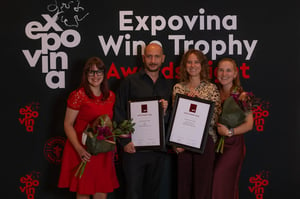
An iconic label that elevates the name to design – minimalist, intelligent and perfectly to the point.
The creative idea takes up the meaning of Œil de Perdrix and translates it into a distinctive appearance with a single graphic element. The result is a consistently reduced design that convinces through precision, clarity and an exceptionally high recognition value.
Submitted by: Weinkellerei Aarau
Image from left to right:
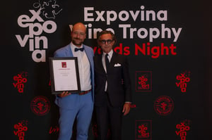
A bold label that celebrates simplicity – reduced, concise and with maximum impact.
With deliberate reduction, this label proves that simplicity requires courage. The clear typography and the uncompromising omission of decorative elements create an independent identity with high recognition value and timeless appeal.
Submitted by: O.H.O. GmbH
Image from left to right:
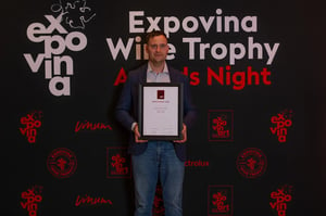
A poetic label that opens up space for one's own stories – finely composed and told with painterly lightness.
The delicate watercolor illustration combines floral elements, symbols and vessels into a multi-layered composition that allows the eye to discover something new again and again. As part of a trilogy, the label unfolds its special strength through its poetic imagery, artistic quality and the harmonious balance between rich detail and lightness.
Submitted by: Niscioo sagl
Image from left to right:
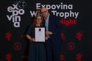
A charming vintage-style label that captures summer and joie de vivre – playful, authentic and designed with great sensitivity.
With hints of Mediterranean beach culture, classic sardine cans and summer fashion, a label full of lightness and character is created. The harmonious color world, the nostalgic typography and the iconic seahorse create a distinctive appearance that evokes emotions and skillfully conveys the carefree attitude to life of a perfect summer day.
Submitted by: Al Mulinetto
Image from left to right:
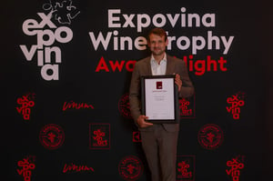
A reduced label with emotional symbolic power – minimalistically designed and consistently implemented as a matter of the heart.
The harmonious combination of the characteristic bottle shape, the traditional ornaments of the winery and the black heart creates an independent and contemporary overall image. The deliberately unusual heart becomes a strong eye-catcher and lends the reduced design an emotional depth that elegantly combines authenticity, origin and passion.
Submitted by: Zweifel 1898 AG
Image from left to right:
A likeable label with sketchy charm – playful, authentic and designed with lots of personality.
The fine illustration looks like a spontaneous sketch that could have been created on a placemat during a meal together. It is precisely this unconstrained lightness that gives Raúl its unmistakable character. With a wink of the eye, the label tells a story, creates emotional closeness and ensures that Raúl remains in the viewer's memory with a smile for a long time.
Submitted by: Weinkellereien Aarau AG
Image from left to right:
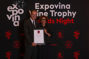
A conceptually strong label that makes the familiar newly visible – visually surprising and implemented with fascinating imagery.
As the second part of the Metamorphosis trilogy, this label transforms a familiar element of viticulture into an independent visual composition. The extraordinary macro perspective abstracts forms, structures and rhythms and opens up new perspectives on the world of wine. This creates an exciting interplay of photography, design and concept that makes the idea of metamorphosis impressively tangible.
Submitted by: binder weine
Image from left to right:
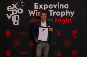
A mysterious label that only tells its story when discovered – radically reduced and consistently designed down to the smallest detail.
At first glance, the label appears almost monochrome, but with every turn of the bottle, new information is revealed. Typography and design continue beyond the label onto the neck of the bottle, making the bottle itself part of the design. This deliberately slowed-down staging arouses curiosity, invites discovery and turns a minimalist appearance into an extraordinary brand experience.
Submitted by: Adriatic Terroir
Image from left to right:
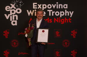
An enigmatic label full of symbolism and character – striking, independent and with high recognition value.
The stylized illustration eludes clear categorization and moves skillfully between pre-Columbian symbolism, folkloric influences and graphic modernity. Precisely this ambiguity arouses curiosity and invites discovery of the story behind the wine. The striking motif remains in the memory and makes the label a distinctive brand ambassador.
Submitted by: myvinodeal
Image from left to right:
WINNERS
-
All
-
Winner 2025
-
Cantina alla Maggia
-
Coop
-
Domaines Rouvinez
-
Transgourmet Switzerland
-
Aagne Winery
-
Wyhus Ryf
A bold, perfectly staged label with an iconic cutout - uncompromisingly modern and visually outstanding.
\n
A prime example of effective packaging design: the precisely placed cutout with golden framing creates a visual center of high recognition value. This is supported by a minimalist, deep black overall aesthetic that adds elegance and tension through subtle graphic motifs create elegance and tension. The label has a modern look, bold and yet true to the brand - a clear eye-catcher on the wine shelf and a statement in the premium segment.
Submitted by: Cantina alla Maggia
An artistically designed label with a strong choice of colors that surprises with its calm, typography and character.
\n
An appearance like a graphic manifesto: the label presents itself like a page from an artistic book or an invitation card from the world of culture. The typographic composition is harmonious and precise, the owl an iconic brand motif that arouses curiosity. Particularly bold: the warm, orange-colored surface - a strong, rare tone on the wine shelf, which nevertheless confident and stylish. This label tells a story without being loud - and remains in the memory for precisely that reason.
\n
Submitted by: Coop
A label with humor, style and bold design language - fresh, precise and striking.
\n
The name is a direct hit - tongue-in-cheek, independent and immediately in the memory. The stylized sheep graphic with the distinctive black nose is precisely placed and charmingly conveys the brand identity. The typography is clear and high-quality, while the minimalist label design leaves room for the rosé tone to take effect. Particularly innovative: the open label cut at the bottom, which lends lightness and independence. A well thought-out, modern concept with recognition value.
Submitted by: Domaines Rouvinez
Like a visual poem - reduced, unusual and perfectly matched to the name.
\n
A label that achieves maximum effect with minimal means: The golden picture surface with ladder, moon and stars unfolds a symbolism - almost like a postcard from a dream world. The scenery is unusual, finely narrated and visually strong. It plays subtly plays with the idea of a \"Notte Rossa\" - a deep, sensual night - and anchors the brand coherently in the emotional space. The clear typography and balanced design emphasize the poetic character.
Submitted by: Transgourmet Switzerland
A visual statement for individuality - reduced, bold and full of subtext.
\n
A label that conveys a clear message with radical reduction and modern color aesthetics conveys a clear message: No off-the-peg wine here. The striking typography of the \"aagne\" brand, deliberately in small letters and fragmented, is reinforced by the graphic element of the tear as an emotional bracket for a wine that deliberately defies categorization. The colored blocks look like a modular system, but break every norm through their free rhythm. This label stands out - quietly, self-confidently and unconventional.
Submitted by: Aagne Winery
A vintage label with cigar flair - old-fashioned, yes, but with class and a style all of its own.
\n
This label plays masterfully with the aesthetics of old cigar bands - opulent, ornamental and surprisingly fresh at the same time. The classic typography, the centered layout and the ornate elements are harmoniously implemented down to the last detail and give the wine a cool retro touch. The transfer from the world of cigars is not only successful visually, but also atmospherically an original reinterpretation that is both nostalgic and stylish at the same time.
\n
Submitted by: Wyhus Ryf AG
A label that convinces with silence - elegant, reduced and of timeless class.
\n
A label that speaks through emptiness: the deliberate use of white space white space lends the design calm, dignity and depth - and allows the classic classic typography and the stylized lighthouse symbol all the more powerful. This minimalist design allows the content to take precedence and yet conveys a clear message: Origin, character and maturity. The tower - sober, almost like a chess piece acts as a striking symbol of steadfastness and origin. An elegant staging with a lot of understatement.
\n
Submitted by: Wyhus Rhy AG
SECTION IMAGE BOXES - TITLE
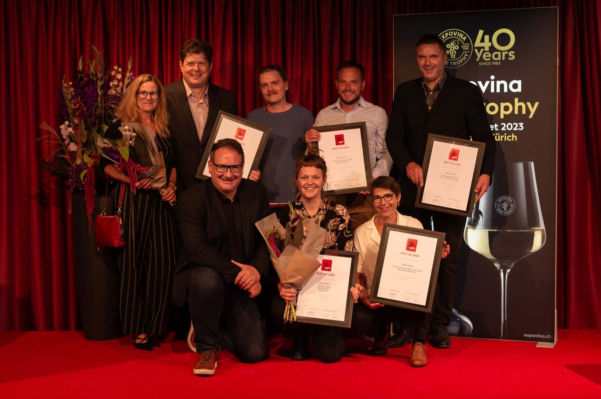
Award for outstanding marketing achievements. A new jury of renowned experts
experts evaluated 71 labels of the best-of-nominated wines.
A maximum of 10% of the submissions could be awarded a prize - seven wines received the
were honored with the expovinArt Award this year. A competition with potential and
an important signal to the Swiss wine industry not only to produce excellent wines
wines, but also to position itself in wine marketing at an international level.
in wine marketing.
-
All
-
Winner 2025
-
Cantina alla Maggia
-
Coop
-
Domaines Rouvinez
-
Transgourmet Switzerland
-
Aagne Winery
-
Wyhus Ryf
EXPOVINA WINE TROPHY - expovinArt
The following jury members were selected for the expert evaluation of expovinArt 2025.
- Jury 2025